I Reimplemented tmux in CSS
How I rebuilt my entire neovim setup in the browser: web components, a static site generator, and a fight to the death with line-height.
How I rebuilt my entire neovim setup in the browser: web components, a static site generator, and a fight to the death with line-height.
TL;DR: I spend my day in Ghostty + tmux + neovim, so my site is the terminal (a draggable window, tmux tabs, a
:command palette, line numbers in the gutter), not a screenshot of one. Built from four boring parts: Eleventy, Lit, esbuild, and Caddy. Here's how to make a pile of static files behave like an OS without lying to a search engine.
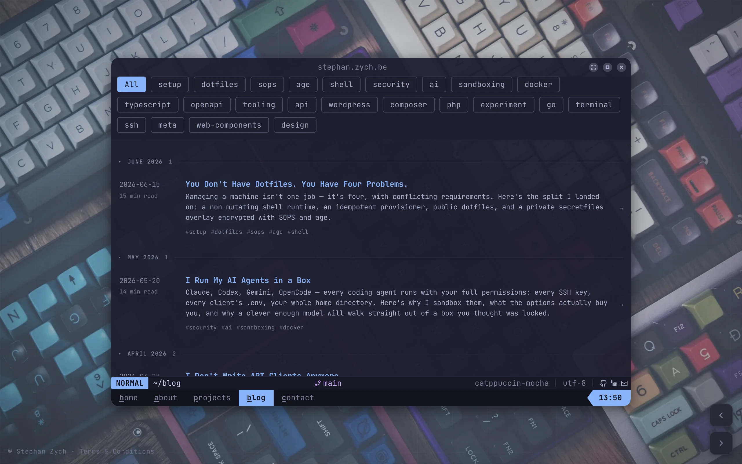
Most developers reach for a minimal portfolio template, change the accent colour, and call it a personality. I spend ten hours a day inside Ghostty + tmux + neovim, Catppuccin Mocha burned permanently into my retinas, so when it came time to build my own site, the only honest move was to ship the thing I actually live in.
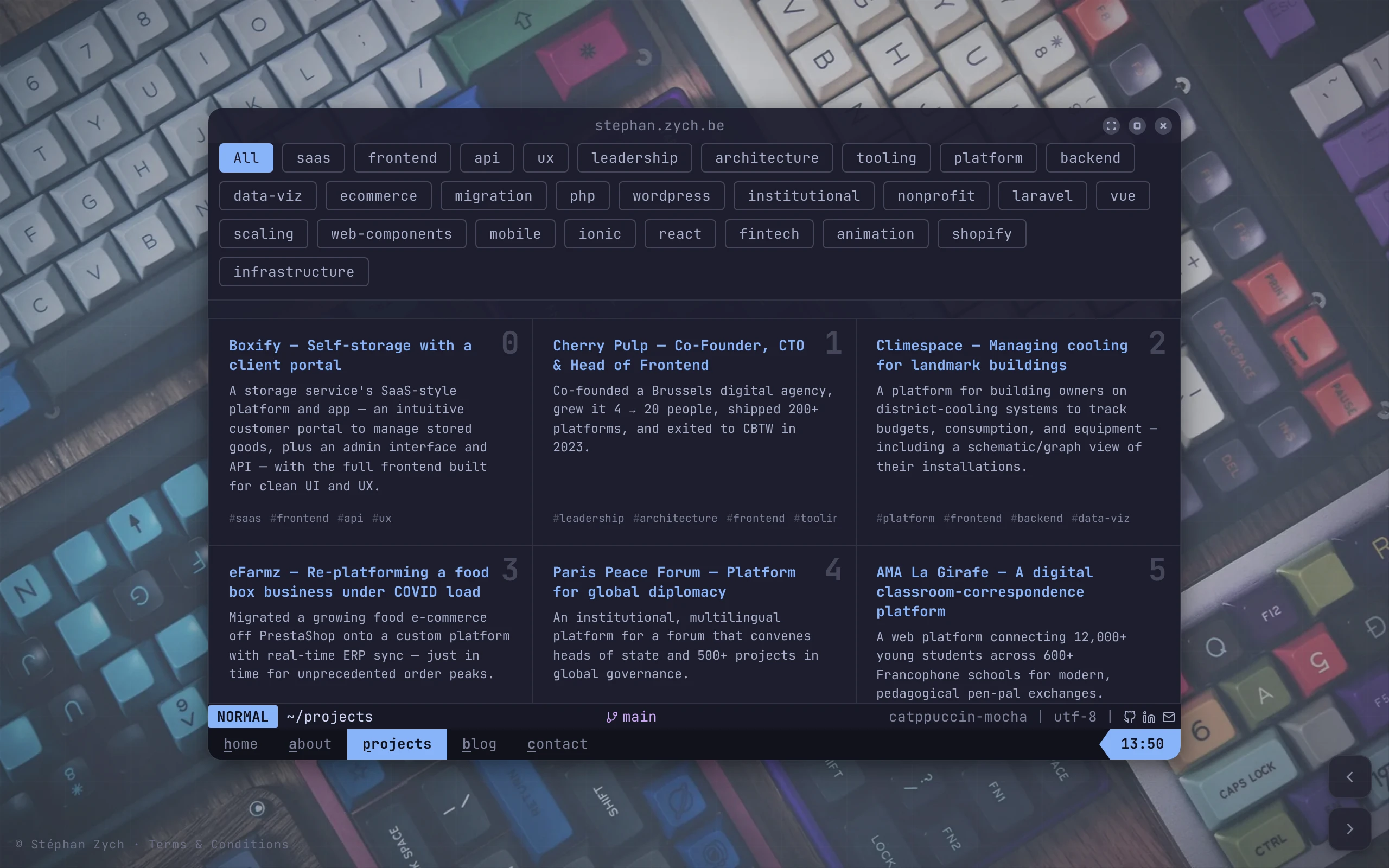
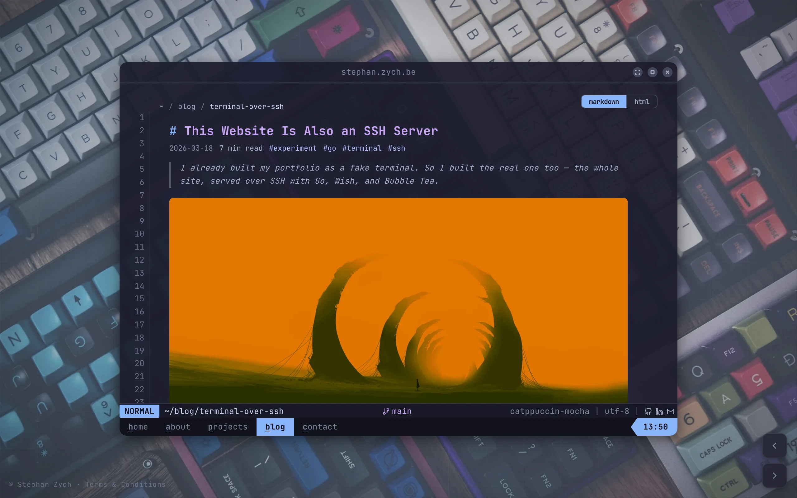
So the website is the terminal. Not a screenshot of one. Not a CSS theme that gestures at one. A draggable window, tmux-style tabs, a : command palette, line numbers down the gutter: the whole apparatus, running in a browser tab. This is the first post on the new site, and the story of how it's built, with one architectural decision tucked in that I'll cash in later.
The stack is boring on purpose
No framework-of-the-month. No 400KB hydration bundle. The whole thing is four moving parts:
- Eleventy 3 turns Markdown and Nunjucks into static HTML.
- Lit 3 web components add the interactivity.
- esbuild bundles the TypeScript.
- Caddy serves the result, though a CDN like GitHub Pages would do the job just as well.
The interesting decisions weren't what to use. They were how to make a pile of static files behave like an operating system without lying to a search engine.
Three windows deep
The illusion stacks three levels:
- A desktop: wallpaper, app icons, the bottom statusline.
- A terminal window: draggable, resizable, three display modes (windowed, full-page, fullscreen).
- tmux-style tabs and panes living inside that window, with Alt+1-5 to switch.
Every layer is its own web component. None of them owns the content. That separation is the whole trick, and it's the part most "fancy" sites get wrong.
Light DOM, or: how to be clever without being invisible
The cardinal sin of the over-engineered personal site is rendering everything client-side, so Google sees <body></body> and a spinner. I wanted the terminal cosplay and the SEO of a plain HTML page. You can have both if you stop hiding your content inside shadow roots.
So the actual text (every project, every blog post, this sentence) is rendered by Eleventy into the light DOM as ordinary, crawlable HTML. The web components don't contain the content; they enhance it. <sz-markdown> wraps real markup and decorates it at runtime: syntax highlighting, heading glyphs, the line-number gutter. Kill the JavaScript and you still get a readable, indexable document. Run it, and the same document grows a terminal around itself.
Progressive enhancement isn't retro. It's just the version of "interactive" that survives a flaky network and a crawler that doesn't run your JS.
The hardest part was a single number
I will save you the time I lost: the genuinely brutal part of this build was not the window manager, the palette, or the theming. It was making line numbers line up.
render-markdown.nvim puts numbers down the left gutter, and every line of content sits on a fixed vertical rhythm. To reproduce that on the web, every element's height has to be an exact multiple of one line. One grid unit, and the entire page snaps to it:
:root {
  --sz-font-size: 13px;
  --sz-line-height: 1.6;
  --sz-line-px: calc(var(--sz-font-size) * var(--sz-line-height));
}
Then I tried to count lines by measuring scrollHeight and dividing by the line height, and got thousands of phantom lines. The trap:
getComputedStyle().lineHeightcan hand you back"1.6", a unitless multiplier, instead of"20.8px". Divide a pixel height by1.6and your gutter thinks the page is a kilometre long.
You have to resolve that ratio against the font size yourself before you divide. One unit confusion, hours of "why is there a number 4,812."
Tables were their own special hell. Each horizontal rule has to occupy a full line of vertical space or the whole grid drifts. Borders won't do it: a 1px border is 1px, not 20.8. The fix is to paint the rules with a linear-gradient background positioned at exact pixel offsets, so the lines land on the grid instead of nudging everything below them off it:
| Element | Naïve approach | Why it broke |
|---|---|---|
| Body text | line-height: 1.6 | unitless ≠ pixels |
| Table rules | 1px border | 1px ≠ one grid line |
| Headings | margin: 1em | em ≠ multiple of grid |
Everything participates in the grid, or nothing does. There is no "mostly aligned."
One source, ready for a second renderer
Here's the decision I'll cash in later: none of the layout code touches the content. Projects and posts are plain Markdown and JSON in a content/ directory that this Eleventy build reads at compile time. The renderer and the facts are completely decoupled, which means another renderer could read the same folder and serve the same site somewhere else entirely. I don't have a second front-end yet. But I built this one so the day I want one, I write my bio zero additional times.
Worth it?
The entire terminal — window manager, tabs, palette, theme engine, the grid that nearly ended me — bundles to roughly 19KB gzipped. Less than the hero image on most portfolio templates, and considerably more fun to maintain than another card grid.
Was reimplementing tmux in CSS a reasonable use of a weekend? No. Would I do it again? Almost certainly. And now that the content lives in its own decoupled folder, I'm already wondering what else could render it.
Source: github.com/monkeymonk/stephan.zych.be. The terminal isn't a theme here, it's the site.